Eje secundario con twinx (): ¿cómo agregar a la leyenda?
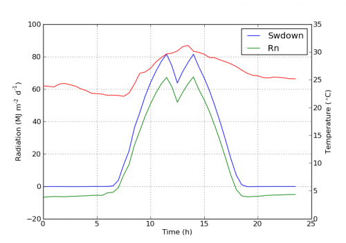
Tengo una gráfica con dos ejes y, usando twinx(). También doy etiquetas a las líneas, y quiero mostrarlas con legend(), pero solo logro obtener las etiquetas de un eje en la leyenda:
import numpy as np
import matplotlib.pyplot as plt
from matplotlib import rc
rc('mathtext', default='regular')

fig = plt.figure()
ax = fig.add_subplot(111)
ax.plot(time, Swdown, '-', label = 'Swdown')
ax.plot(time, Rn, '-', label = 'Rn')
ax2 = ax.twinx()
ax2.plot(time, temp, '-r', label = 'temp')
ax.legend(loc=0)
ax.grid()
ax.set_xlabel("Time (h)")
ax.set_ylabel(r"Radiation ($MJ\,m^{-2}\,d^{-1}$)")
ax2.set_ylabel(r"Temperature ($^\circ$C)")
ax2.set_ylim(0, 35)
ax.set_ylim(-20,100)
plt.show()
Así que solo obtengo las etiquetas del primer eje en la leyenda, y no la etiqueta 'temp' del segundo eje. ¿Cómo podría añadir esta tercera etiqueta a la leyenda?
6 answers
Puede agregar fácilmente una segunda leyenda agregando la línea:
ax2.legend(loc=0)
Obtendrás esto:
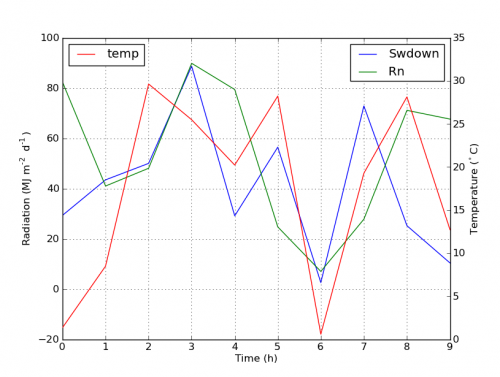
Pero si quieres todas las etiquetas en una leyenda entonces deberías hacer algo como esto:
import numpy as np
import matplotlib.pyplot as plt
from matplotlib import rc
rc('mathtext', default='regular')

time = np.arange(10)
temp = np.random.random(10)*30
Swdown = np.random.random(10)*100-10
Rn = np.random.random(10)*100-10

fig = plt.figure()
ax = fig.add_subplot(111)

lns1 = ax.plot(time, Swdown, '-', label = 'Swdown')
lns2 = ax.plot(time, Rn, '-', label = 'Rn')
ax2 = ax.twinx()
lns3 = ax2.plot(time, temp, '-r', label = 'temp')

# added these three lines
lns = lns1+lns2+lns3
labs = [l.get_label() for l in lns]
ax.legend(lns, labs, loc=0)

ax.grid()
ax.set_xlabel("Time (h)")
ax.set_ylabel(r"Radiation ($MJ\,m^{-2}\,d^{-1}$)")
ax2.set_ylabel(r"Temperature ($^\circ$C)")
ax2.set_ylim(0, 35)
ax.set_ylim(-20,100)
plt.show()
Que te dará esto:
Warning: date(): Invalid date.timezone value 'Europe/Kyiv', we selected the timezone 'UTC' for now. in /var/www/agent_stack/data/www/ajaxhispano.com/template/agent.layouts/content.php on line 61
2011-03-30 13:32:09
No estoy seguro de si esta funcionalidad es nueva, pero también puede usar el método get_legend_handles_labels () en lugar de realizar un seguimiento de las líneas y etiquetas usted mismo:
import numpy as np
import matplotlib.pyplot as plt
from matplotlib import rc
rc('mathtext', default='regular')

pi = np.pi

# fake data
time = np.linspace (0, 25, 50)
temp = 50 / np.sqrt (2 * pi * 3**2) \
        * np.exp (-((time - 13)**2 / (3**2))**2) + 15
Swdown = 400 / np.sqrt (2 * pi * 3**2) * np.exp (-((time - 13)**2 / (3**2))**2)
Rn = Swdown - 10

fig = plt.figure()
ax = fig.add_subplot(111)

ax.plot(time, Swdown, '-', label = 'Swdown')
ax.plot(time, Rn, '-', label = 'Rn')
ax2 = ax.twinx()
ax2.plot(time, temp, '-r', label = 'temp')

# ask matplotlib for the plotted objects and their labels
lines, labels = ax.get_legend_handles_labels()
lines2, labels2 = ax2.get_legend_handles_labels()
ax2.legend(lines + lines2, labels + labels2, loc=0)

ax.grid()
ax.set_xlabel("Time (h)")
ax.set_ylabel(r"Radiation ($MJ\,m^{-2}\,d^{-1}$)")
ax2.set_ylabel(r"Temperature ($^\circ$C)")
ax2.set_ylim(0, 35)
ax.set_ylim(-20,100)
plt.show()
Warning: date(): Invalid date.timezone value 'Europe/Kyiv', we selected the timezone 'UTC' for now. in /var/www/agent_stack/data/www/ajaxhispano.com/template/agent.layouts/content.php on line 61
2012-04-12 18:21:22
Puede obtener fácilmente lo que desea agregando la línea en ax:
ax.plot(0, 0, '-r', label = 'temp')
O
ax.plot(np.nan, '-r', label = 'temp')
Esto no trazaría nada más que agregar una etiqueta a legend of ax.
Creo que esta es una manera mucho más fácil. No es necesario rastrear las líneas automáticamente cuando solo tiene unas pocas líneas en los segundos ejes, ya que la fijación a mano como la anterior sería bastante fácil. De todos modos, depende de lo que necesites.
El código completo es el siguiente:
import numpy as np
import matplotlib.pyplot as plt
from matplotlib import rc
rc('mathtext', default='regular')

time = np.arange(22.)
temp = 20*np.random.rand(22)
Swdown = 10*np.random.randn(22)+40
Rn = 40*np.random.rand(22)

fig = plt.figure()
ax = fig.add_subplot(111)
ax2 = ax.twinx()

#---------- look at below -----------

ax.plot(time, Swdown, '-', label = 'Swdown')
ax.plot(time, Rn, '-', label = 'Rn')

ax2.plot(time, temp, '-r')  # The true line in ax2
ax.plot(np.nan, '-r', label = 'temp')  # Make an agent in ax

ax.legend(loc=0)

#---------------done-----------------

ax.grid()
ax.set_xlabel("Time (h)")
ax.set_ylabel(r"Radiation ($MJ\,m^{-2}\,d^{-1}$)")
ax2.set_ylabel(r"Temperature ($^\circ$C)")
ax2.set_ylim(0, 35)
ax.set_ylim(-20,100)
plt.show()
, La trama es como abajo:
Actualización: añadir una versión mejor:
ax.plot(np.nan, '-r', label = 'temp')
Esto no hará nada mientras que plot(0, 0) puede cambiar el rango del eje.
Warning: date(): Invalid date.timezone value 'Europe/Kyiv', we selected the timezone 'UTC' for now. in /var/www/agent_stack/data/www/ajaxhispano.com/template/agent.layouts/content.php on line 61
2017-05-08 12:28:36
A partir de la versión 2.1 de matplotlib, puede usar una leyenda de figura . En lugar de ax.legend(), que produce una leyenda con las manijas de los ejes ax, se puede crear una leyenda de figura
fig.legend(loc=1)
Que reunirá todos los controladores de todas las subtramas de la figura. Dado que es una leyenda de figura, se colocará en la esquina de la figura, y el argumento loc es relativo a la figura.
import numpy as np
import matplotlib.pyplot as plt

x = np.linspace(0,10)
y = np.linspace(0,10)
z = np.sin(x/3)**2*98

fig = plt.figure()
ax = fig.add_subplot(111)
ax.plot(x,y, '-', label = 'Quantity 1')

ax2 = ax.twinx()
ax2.plot(x,z, '-r', label = 'Quantity 2')
fig.legend(loc=1)

ax.set_xlabel("x [units]")
ax.set_ylabel(r"Quantity 1")
ax2.set_ylabel(r"Quantity 2")

plt.show()

Con el fin de colocar la leyenda de nuevo en el ejes, uno suministraría a bbox_to_anchor y a bbox_transform. Este último sería la transformación de ejes de los ejes en los que debería residir la leyenda. Las primeras pueden ser las coordenadas del borde definidas por loc dadas en coordenadas de ejes.
fig.legend(loc=1, bbox_to_anchor=(1,1), bbox_transform=ax.transAxes)

Warning: date(): Invalid date.timezone value 'Europe/Kyiv', we selected the timezone 'UTC' for now. in /var/www/agent_stack/data/www/ajaxhispano.com/template/agent.layouts/content.php on line 61
2017-11-18 21:01:28
Un truco rápido que puede satisfacer sus necesidades..
Retire el marco de la caja y coloque manualmente las dos leyendas una al lado de la otra. Algo como esto..
ax1.legend(loc = (.75,.1), frameon = False)
ax2.legend( loc = (.75, .05), frameon = False)
Donde la tupla loc es porcentajes de izquierda a derecha y de abajo a arriba que representan la ubicación en el gráfico.
Warning: date(): Invalid date.timezone value 'Europe/Kyiv', we selected the timezone 'UTC' for now. in /var/www/agent_stack/data/www/ajaxhispano.com/template/agent.layouts/content.php on line 61
2015-10-05 20:28:51
Encontré un siguiente ejemplo oficial de matplotlib que usa host_subplot para mostrar múltiples ejes y y todas las etiquetas diferentes en una leyenda. No es necesaria ninguna solución. La mejor solución que he encontrado hasta ahora. http://matplotlib.org/examples/axes_grid/demo_parasite_axes2.html
from mpl_toolkits.axes_grid1 import host_subplot
import mpl_toolkits.axisartist as AA
import matplotlib.pyplot as plt

host = host_subplot(111, axes_class=AA.Axes)
plt.subplots_adjust(right=0.75)

par1 = host.twinx()
par2 = host.twinx()

offset = 60
new_fixed_axis = par2.get_grid_helper().new_fixed_axis
par2.axis["right"] = new_fixed_axis(loc="right",
                                    axes=par2,
                                    offset=(offset, 0))

par2.axis["right"].toggle(all=True)

host.set_xlim(0, 2)
host.set_ylim(0, 2)

host.set_xlabel("Distance")
host.set_ylabel("Density")
par1.set_ylabel("Temperature")
par2.set_ylabel("Velocity")

p1, = host.plot([0, 1, 2], [0, 1, 2], label="Density")
p2, = par1.plot([0, 1, 2], [0, 3, 2], label="Temperature")
p3, = par2.plot([0, 1, 2], [50, 30, 15], label="Velocity")

par1.set_ylim(0, 4)
par2.set_ylim(1, 65)

host.legend()

plt.draw()
plt.show()
Warning: date(): Invalid date.timezone value 'Europe/Kyiv', we selected the timezone 'UTC' for now. in /var/www/agent_stack/data/www/ajaxhispano.com/template/agent.layouts/content.php on line 61
2015-03-17 14:15:53