transformación css, bordes dentados en chrome
He estado usando CSS3 transform para rotar imágenes y cuadros de texto con bordes en mi sitio web.
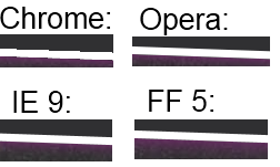
El problema es que el borde se ve irregular en Chrome, como un juego (de baja resolución) sin Anti-Aliasing. En IE, Opera y FF se ve mucho mejor porque se utiliza AA (que todavía es claramente visible, pero no tan malo). No puedo probar Safari porque no tengo una Mac.
La foto rotada y el texto en sí se ven bien, es solo el borde que se ve dentado.
El CSS que uso es esto:
.rotate2deg {
    transform: rotate(2deg);
    -ms-transform: rotate(2deg); /* IE 9 */
    -webkit-transform: rotate(2deg); /* Safari and Chrome */
    -o-transform: rotate(2deg); /* Opera */
    -moz-transform: rotate(2deg); /* Firefox */
}
¿Hay alguna manera de arreglar esto, por ejemplo, forzando a Chrome a usar AA?
Ejemplo a continuación:
11 answers
En caso de que alguien esté buscando esto más adelante, un buen truco para deshacerse de esos bordes dentados en las transformaciones CSS en Chrome es agregar la propiedad CSS -webkit-backface-visibility con un valor de hidden. En mis propias pruebas, esto las ha suavizado completamente. Espero que eso ayude.
-webkit-backface-visibility: hidden;
Warning: date(): Invalid date.timezone value 'Europe/Kyiv', we selected the timezone 'UTC' for now. in /var/www/agent_stack/data/www/ajaxhispano.com/template/agent.layouts/content.php on line 61
2013-05-08 21:12:30
Si está utilizando transition en lugar de transform, -webkit-backface-visibility: hidden; no funciona. Un borde dentado aparece durante la animación para un archivo png transparente.
Para resolverlo usé: outline: 1px solid transparent;
Warning: date(): Invalid date.timezone value 'Europe/Kyiv', we selected the timezone 'UTC' for now. in /var/www/agent_stack/data/www/ajaxhispano.com/template/agent.layouts/content.php on line 61
2014-11-21 16:11:51
Pruebe la transformación 3d. Esto funciona como un encanto!
/* Due to a bug in the anti-liasing*/
-webkit-transform-style: preserve-3d;
-webkit-transform: rotateZ(2deg);
Warning: date(): Invalid date.timezone value 'Europe/Kyiv', we selected the timezone 'UTC' for now. in /var/www/agent_stack/data/www/ajaxhispano.com/template/agent.layouts/content.php on line 61
2011-08-11 05:25:18
Agregar un borde transparente de 1px activará suavizado
outline: 1px solid transparent;
Alternativamente, agregue una sombra de caja transparente de 1px.
box-shadow: 0 0 1px rgba(255,255,255,0);
Warning: date(): Invalid date.timezone value 'Europe/Kyiv', we selected the timezone 'UTC' for now. in /var/www/agent_stack/data/www/ajaxhispano.com/template/agent.layouts/content.php on line 61
2018-08-24 11:05:58
La respuesta elegida (ni ninguna de las otras respuestas) no funcionó para mí, pero esto sí:img {outline:1px solid transparent;}
Warning: date(): Invalid date.timezone value 'Europe/Kyiv', we selected the timezone 'UTC' for now. in /var/www/agent_stack/data/www/ajaxhispano.com/template/agent.layouts/content.php on line 61
2015-08-06 06:02:03
He estado teniendo un problema con un gradiente CSS3 con-45deg. El background inclinado, era muy irregular similar pero peor que el post original. Así que empecé a jugar con ambos background-size. Este estiraría la jaggedness, pero todavía estaba allí. Luego, además, leí que otras personas también tienen problemas en incrementos de 45 grados, así que ajusté de -45deg a -45.0001deg y mi problema se resolvió.
En mi CSS a continuación, background-size fue inicialmente 30px y el deg para el degradado de fondo era exactamente -45deg, y todos los fotogramas clave eran 30px 0.
    @-webkit-keyframes progressStripeLTR {
        to {
            background-position: 60px 0;
        };
    }

    @-moz-keyframes progressStripeLTR {
        to {
            background-position: 60px 0;
        };
    }

    @-ms-keyframes progressStripeLTR {
        to {
            background-position: 60px 0;
        };
    }

    @-o-keyframes progressStripeLTR {
        to {
            background-position: 60px 0;
        };
    }

    @keyframes progressStripeLTR {
        to {
            background-position: 60px 0;
        };
    }

    @-webkit-keyframes progressStripeRTL {
        to {
            background-position: -60px 0;
        };
    }

    @-moz-keyframes progressStripeRTL {
        to {
            background-position: -60px 0;
        };
    }

    @-ms-keyframes progressStripeRTL {
        to {
            background-position: -60px 0;
        };
    }

    @-o-keyframes progressStripeRTL {
        to {
            background-position: -60px 0;
        };
    }

    @keyframes progressStripeRTL {
        to {
            background-position: -60px 0;
        };
    }

    .pro-bar-candy {
        width: 100%;
        height: 15px;

        -webkit-border-radius:  3px;
        -moz-border-radius:     3px;
        border-radius:          3px;

        background: rgb(187, 187, 187);
        background: -moz-linear-gradient(
                        -45.0001deg,
                        rgba(187, 187, 187, 1.00) 25%,
                        transparent 25%,
                        transparent 50%,
                        rgba(187, 187, 187, 1.00) 50%,
                        rgba(187, 187, 187, 1.00) 75%,
                        transparent 75%,
                        transparent
                    );
        background: -webkit-linear-gradient(
                        -45.0001deg,
                        rgba(187, 187, 187, 1.00) 25%,
                        transparent 25%,
                        transparent 50%,
                        rgba(187, 187, 187, 1.00) 50%,
                        rgba(187, 187, 187, 1.00) 75%,
                        transparent 75%,
                        transparent
                    );
        background: -o-linear-gradient(
                        -45.0001deg,
                        rgba(187, 187, 187, 1.00) 25%,
                        transparent 25%,
                        transparent 50%,
                        rgba(187, 187, 187, 1.00) 50%,
                        rgba(187, 187, 187, 1.00) 75%,
                        transparent 75%,
                        transparent
                    );
        background: -ms-linear-gradient(
                        -45.0001deg,
                        rgba(187, 187, 187, 1.00) 25%,
                        transparent 25%,
                        transparent 50%,
                        rgba(187, 187, 187, 1.00) 50%,
                        rgba(187, 187, 187, 1.00) 75%,
                        transparent 75%,
                        transparent
                    );
        background: linear-gradient(
                        -45.0001deg,
                        rgba(187, 187, 187, 1.00) 25%,
                        transparent 25%,
                        transparent 50%,
                        rgba(187, 187, 187, 1.00) 50%,
                        rgba(187, 187, 187, 1.00) 75%,
                        transparent 75%,
                        transparent
                    );
        background: -webkit-gradient(
                        linear,
                        right bottom,
                        right top,
                        color-stop(
                            25%,
                            rgba(187, 187, 187, 1.00)
                        ),
                        color-stop(
                            25%,
                            rgba(0, 0, 0, 0.00)
                        ),
                        color-stop(
                            50%,
                            rgba(0, 0, 0, 0.00)
                        ),
                        color-stop(
                            50%,
                            rgba(187, 187, 187, 1.00)
                        ),
                        color-stop(
                            75%,
                            rgba(187, 187, 187, 1.00)
                        ),
                        color-stop(
                            75%,
                            rgba(0, 0, 0, 0.00)
                        ),
                        color-stop(
                            rgba(0, 0, 0, 0.00)
                        )
                    );

        background-repeat: repeat-x;
        -webkit-background-size:    60px 60px;
        -moz-background-size:       60px 60px;
        -o-background-size:         60px 60px;
        background-size:            60px 60px;
        }

    .pro-bar-candy.candy-ltr {
        -webkit-animation:  progressStripeLTR .6s linear infinite;
        -moz-animation:     progressStripeLTR .6s linear infinite;
        -ms-animation:      progressStripeLTR .6s linear infinite;
        -o-animation:       progressStripeLTR .6s linear infinite;
        animation:          progressStripeLTR .6s linear infinite;
        }

    .pro-bar-candy.candy-rtl {
        -webkit-animation:  progressStripeRTL .6s linear infinite;
        -moz-animation:     progressStripeRTL .6s linear infinite;
        -ms-animation:      progressStripeRTL .6s linear infinite;
        -o-animation:       progressStripeRTL .6s linear infinite;
        animation:          progressStripeRTL .6s linear infinite;
        }
Warning: date(): Invalid date.timezone value 'Europe/Kyiv', we selected the timezone 'UTC' for now. in /var/www/agent_stack/data/www/ajaxhispano.com/template/agent.layouts/content.php on line 61
2016-08-10 22:05:11
Es posible que pueda enmascarar el dentado usando borrosa caja-sombras. Usar-webkit-box-shadow en lugar de box-shadow se asegurará de que no afecte a los navegadores que no son webkit. Es posible que desee comprobar Safari y los navegadores webkit móviles sin embargo.
El resultado es algo mejor, pero mucho menos bueno que con los otros navegadores:

Warning: date(): Invalid date.timezone value 'Europe/Kyiv', we selected the timezone 'UTC' for now. in /var/www/agent_stack/data/www/ajaxhispano.com/template/agent.layouts/content.php on line 61
2014-10-09 09:38:26
Solo pensé que nos gustaría lanzar en nuestra solución también, ya que teníamos exactamente el mismo problema en Chrome/Windows.
Probamos la solución de @stevenWatkins arriba, pero todavía teníamos el "paso a paso".
En lugar de
-webkit-backface-visibility: hidden;
Usamos:
-webkit-backface-visibility: initial;
Para nosotros esto hizo el truco
Warning: date(): Invalid date.timezone value 'Europe/Kyiv', we selected the timezone 'UTC' for now. in /var/www/agent_stack/data/www/ajaxhispano.com/template/agent.layouts/content.php on line 61
2017-08-17 11:29:19
Agregar lo siguiente en el div que rodea el elemento en cuestión arregló esto para mí.
-webkit-transform-style: preserve-3d;
Los bordes dentados estaban apareciendo alrededor de la ventana de video en mi caso.
Warning: date(): Invalid date.timezone value 'Europe/Kyiv', we selected the timezone 'UTC' for now. in /var/www/agent_stack/data/www/ajaxhispano.com/template/agent.layouts/content.php on line 61
2017-09-19 22:23:55
Para mí fue la propiedad CSS perspective la que hizo el truco:
-webkit-perspective: 1000;
Completamente ilógico en mi caso, ya que no uso transiciones 3d, pero funciona sin embargo.
Warning: date(): Invalid date.timezone value 'Europe/Kyiv', we selected the timezone 'UTC' for now. in /var/www/agent_stack/data/www/ajaxhispano.com/template/agent.layouts/content.php on line 61
2014-03-10 15:41:00
Para canvas en Chrome (Versión 52)
Todas las respuestas listadas son sobre imágenes. Pero mi problema es sobre lienzo en chrome (v. 52) con transformar girar. Se volvieron irregulares y todos estos métodos no pueden ayudar.
Solución que funciona para mí:
- Hacer el lienzo más grande en 1 px para cada lado => +2 px para ancho y alto;
- Dibuje la imagen con offset + 1px (en la posición 1,1 en lugar de 0,0) y tamaño fijo (el tamaño de la imagen debe ser 2px menor que el tamaño de lienzo)
- Aplicar rotación requerida
Bloques de código tan importantes:
// Unfixed version
ctx.drawImage(img, 0, 0, 335, 218);
// Fixed version
ctx.drawImage(img, 1, 1, 335, 218);
/* This style should be applied for fixed version */
canvas {
margin-left: -1px;
margin-top:-1px;
} <!--Unfixed version-->
<canvas width="335" height="218"></canvas>
<!--Fixed version-->
<canvas width="337" height="220"></canvas>Muestra: https://jsfiddle.net/tLbxgusx/1 /
Nota: hay muchos divs anidados porque es una versión simplificada de mi proyecto.
Este número se reproduce también para Firefox para mí. No hay tal problema en Safari y FF con retina.
Y otra solución fundada es colocar canvas en div del mismo tamaño y aplicar el siguiente css a este div:
overflow: hidden;
box-shadow: 0 0 1px rgba(255,255,255,0);
// Or
//outline:1px solid transparent;
Y la rotación debe aplicarse a este div de envoltura. La solución tan enumerada se trabaja pero con la modificación pequeña.
Y el ejemplo modificado para tal solución es: https://jsfiddle.net/tLbxgusx/2 /
Nota: Ver estilo de div con clase 'tercero'.
Warning: date(): Invalid date.timezone value 'Europe/Kyiv', we selected the timezone 'UTC' for now. in /var/www/agent_stack/data/www/ajaxhispano.com/template/agent.layouts/content.php on line 61
2016-08-26 09:28:13